These are my first attempts and they are below in my sig


These are my first attempts and they are below in my sig

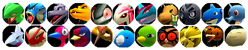
Those are quite nice. I like the color shading you did to make the pokemon look different. It makes them look quite professional. Those are nice little trainer sprites you put in there as well, although I don't recognize them.
BTW, are they your Battle Tower teams, or what? All in all they look very nice to me. Prepare yourself to be bombarded with requests in the near future methinks.
Elrond rambled.
Thanks woohoo
Link (Legend of Zelda) and Issac (Golden Sun) are there just to fill space
Yes, they are quite good. I also like the colour shading, however don't always try to do the same format like the above two always, try to improvize. Good work, anyway.
I think i need new fonts because photoshop ones are boring
In order to make the words more eye-catching, you can play around with some of the layer effects. Just select the words, go to Layer -> Layer Style and choose some of the options. I like Outer Glow, Drop Shadow, and Bevel and Emboss.
----------------------------------------------------------------------------
~*Arkeis.com - Pokemon art and game info!
 Posting Permissions

 Reply With Quote