Reply With Quote
I like the 2010 and 2012 ones a lot cause they have those fancy mirroring effects at the bottom.


With the 2015 Unown Awards officially wrapping, I thought this would be a fun thread to create to give a little look back at past years' Unown Award designs and talk a little bit about my creative process.
So, the Unown Awards go way WAY back, but were revived in 2007. TPM has now had the annual Unown Awards for longer than it didn't, let that sink in. Since then, we've had 4 different hosts, and I've been doing the designs since 2009.
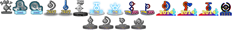
Dark-San hosted in 2007, with that year's designs being rather simple, taking the Unown sprite itself and sticking it on a base with the year 2007 thrown on there.
However, 2008 saw a more complex design. A glow effect was added and the ! and ? Unowns were added to the mix. Those two have been given their own unique color scheme every year since.
After I started doing the Unown designs in 2009, I decided to go back and redo the 2007 and 2008 ones to match my style and specifications, specifically:
-64x64 pixels
-Transparent background
-Same base position for each
The 2007 ones were pretty straightforward, all I did was crop them from 65x65 to 64x64 (a 1-pixel shave!), deleted the white background and moved them so that all of their bases line up.
2008 was a bit more of a challenge. I shrunk them down, which distorted the base for some of them so I deleted that and redid it. Also, it turns out, these had a background too, it just matched the background color of our forums. The problem was that if the forum style ever changed, that background would become visible. Because of the glow, simply deleting the background wouldn't work, it would have left the Unown looking like it had a weird dark border around it on light backgrounds. So, to take care of that I got rid of the original glow and completely redid it using the PNG format's alpha blending feature (for those who aren't familiar with the technical lingo of image editing, alpha blending means making part of the image translucent).
It ended up being a lot more work than I anticipated, but the end result was worth it.
Coming up...
In 2009 with Dark-San's absence, talk about continuing the Unown Awards with a different host started stirring amongst the staff. This led to a quick design process for the next set of Unowns.
Winner of the Unown Awards: 2008 "Hard Work", 2010 "Dedicated", 2012 "Journalist", 2012 "Unown", 2013 "Anchorman", 2014 "Unown", 2015 "Jeff Jeff Jeff Jeff!"
Facebook - YouTube - Miiverse
Diamond: 1418 3196 1413 - SoulSilver: 0217 4582 5426 - White: 1119 9535 7054 - White 2: 1421 4560 4887 - X: same as 3DS
3DS: 3866 8018 5231 - AIM: IslanderJeff02
Joined November 8, 2004 - Modded October 24, 2008

I like the 2010 and 2012 ones a lot cause they have those fancy mirroring effects at the bottom.
Austrian ViceMaster Alex
Winner of the 2014 UnownN award.
Winner of the 2015 UnownW award.
Nifty darn comics
Contact me on Steam, userhandle: avma
Follow me on Twitter: ClarityFV
The 2007 Unown Awards started in July, and the ones in 2008 started in October. When October 2009 came around, Dark-San had been inactive for some time. The future of the Unown Awards hung in the balance and I took it up with the other mods to see what to do. Number1ChanseyFan volunteered to host, but needed someone to do the designs for her. So I volunteered for that, and next thing I knew, N1CF posted the nomination thread in PCG!
So, I had to hurry and get a design done. Luckily, I had images of the Unown sprites and a Pokemon font that I had been using for the main site, so I figured I could throw something simple together.
I wrote the year in the Pokemon fonts, using the traditional yellow and blue of the Pokemon and TPM logos, added the Unowns to it and added a shadow underneath. Since the ? and ! Unowns were given a unique design the previous year, I figured I'd keep that tradition going in a way by using the shiny sprite for them. There isn't really much else to say about this one since I knew I had only a few weeks to get them done, and I was working on the site as well so that all led to a very short design process. But at least, for 2010, I had much more time to prepare, and that was a good thing since that was TPM's 10th anniversary.
Coming up...
A change in venue, how the shortest design process was followed by the longest, and the 2010 trophies we almost got!
Winner of the Unown Awards: 2008 "Hard Work", 2010 "Dedicated", 2012 "Journalist", 2012 "Unown", 2013 "Anchorman", 2014 "Unown", 2015 "Jeff Jeff Jeff Jeff!"
Facebook - YouTube - Miiverse
Diamond: 1418 3196 1413 - SoulSilver: 0217 4582 5426 - White: 1119 9535 7054 - White 2: 1421 4560 4887 - X: same as 3DS
3DS: 3866 8018 5231 - AIM: IslanderJeff02
Joined November 8, 2004 - Modded October 24, 2008


Interesting!
Anyway, the simple ones look good too. The 2003 set were just gold-plated regular Unowns on a base and they looked good enough to inspire a lasting tradition. And the 2011 ones were a great use of a simple design.
But the 2010 ones do look amazing, I wish I had one of those. And the ones from 2015 have an interesting effect.
Annual Unown Awards: Kind (2007), Friendly, Queen (2008), Dedicated (2009), She found Kevin! (2009),
Everyone wins (2011), Tea, World traveler (2012), Busy, Patient (2013),
Durga, Firefox, Twenty Thousand Hidden Posts (2014), Helpful (2015),
Active, Discord, Letter, Unown Awards 2019 (2019).
Don't forget to visit the Dragon's Guild and Dragon Tamers site.
✭Ask me about AC/CC. Adopt a pokemon and Join!✭
I began designing the 2010 Unown Awards almost as soon as the 2009 ones were given out! Knowing that 2010 would mark our 10th anniversary, I wanted these to be special. I decided early on that I wanted to give them a gold base, and figured I'd put the year on top to balance the base. Over the next several months, I came up with a few prototypes.
You can see how the design evolved. The base went from mimicking the 2007 one to the 2008 one, but the year stayed the same. The pokeball images that I used for the zeroes in the year were the same as the ones that I used as the bullet points on the main site. The decision to use pokeballs for the zeroes came directly from the 10th anniversary logo I had created.
Also, the only difference between the last two were some minor tweaks to the base. I was already at the point where I was only making minor changes, but, to use a Nintendo expression, I "updended the tea table" and decided to go in a completely different direction.
As I was experimenting with different styles for the main site, I became pretty fond of the glass look and wanted to incorporate it into the Unown Award designs. I considered making the Unowns themselves transparent, but I wanted to use a reflection effect, so I decided to make the base look like it was made of glass instead. The Unowns themselves became gold, which I did by altering the sprites, and the year moved to the bottom, and there was a good reason for this. If the Unowns had sat directly on the base, I would have had to make a reflection for each of them, but by putting the year below them, I only needed to create one reflection for that. Then, all I had to do was create a single template and add each Unown to it to create the awards. Some other details I thought I'd point out is that there is a slight yellow tint (gray for ? and !) to the base. This was added when I noticed that the glass effect wasn't convincing enough, and I realized that it should be reflecting the yellow glow of the Unowns. Also, the reflection of the year isn't directly below it, but there is actually a slight gap. This is because in real life, when something reflects off of glass, it usually reflects off the bottom of it rather than the top, so that gap makes it look more realistic.
As for the ! and ? Unowns. Well, as usual, they were given their own color scheme. With Pokemon HeartGold and SoulSilver coming out in 2010, I thought I'd give that a nod and make them silver with the other ones being gold. I even took it a step further and made the year gold on them, with the zeros in the year being GS balls. Later years would continue to see designs based on the pokemon games that came out that year.
Coming up...
Prototypes, prototypes, prototypes! A design I couldn't quite nail down as unused ideas from 2010 resurfaced.
Winner of the Unown Awards: 2008 "Hard Work", 2010 "Dedicated", 2012 "Journalist", 2012 "Unown", 2013 "Anchorman", 2014 "Unown", 2015 "Jeff Jeff Jeff Jeff!"
Facebook - YouTube - Miiverse
Diamond: 1418 3196 1413 - SoulSilver: 0217 4582 5426 - White: 1119 9535 7054 - White 2: 1421 4560 4887 - X: same as 3DS
3DS: 3866 8018 5231 - AIM: IslanderJeff02
Joined November 8, 2004 - Modded October 24, 2008
With the release of Pokemon Black and White in 2011, I figured I'd go with a monochrome style to honor them. The problem was figuring out what they'd look like, and I went through several designs:
You can see where I went back and forth on including "TPM" on these awards and you can also see the one where I split the year on the bottom as an experimental thing. I ended up using that style the following year, but I'll get to that
I ultimately decided to start including "TPM" on all future designs as a way of identifying them with our forum. It's also hard to tell, but the Unowns on the 2011 awards are transparent, which was an idea that I had originally planned for 2010. Another idea that came back from the early 2010 design was putting the year at the top. This is something that hasn't been done since because each Unown is a different size, and putting the year at the top of the Unown itself would require the year to be individually positioned for each image. So yes, that's one design decision you can blame on laziness!
Coming up...
Ditching the sprites and switching to my own custom made Unowns. Also, what exactly were the 2012 designs based on? Find out!
Winner of the Unown Awards: 2008 "Hard Work", 2010 "Dedicated", 2012 "Journalist", 2012 "Unown", 2013 "Anchorman", 2014 "Unown", 2015 "Jeff Jeff Jeff Jeff!"
Facebook - YouTube - Miiverse
Diamond: 1418 3196 1413 - SoulSilver: 0217 4582 5426 - White: 1119 9535 7054 - White 2: 1421 4560 4887 - X: same as 3DS
3DS: 3866 8018 5231 - AIM: IslanderJeff02
Joined November 8, 2004 - Modded October 24, 2008
By 2012, I had become clear to me that I wasn't able to do much customization of the Unown sprites without the final result looking a little pixellated. Also, having worked with SVG some I figured it would be a good idea to have SVG versions of the Unowns to use, which would allow me to create images of them at any size that didn't look pixellated at all. I ended up writing the following SVG code:
And it produced the following image:Code:<?xml version="1.0"?> <!DOCTYPE svg PUBLIC "-//W3C//DTD SVG 1.1//EN" "http://www.w3.org/Graphics/SVG/1.1/DTD/svg11-flat.dtd"> <svg xml:lang="en-us" width="448" height="256" viewBox="0 0 448 256" xmlns="http://www.w3.org/2000/svg" xmlns:xlink="http://www.w3.org/1999/xlink"> <style type="text/css"> .unown { fill: white; opacity: .5; } .unown-line { stroke: white; fill: none; stroke-width: 3.5; stroke-linecap: round; stroke-linejoin: round; opacity: .5; } .white { fill: black; opacity: .5; } .pupil { fill: white; } .glare { fill: black; } * { opacity: 1 !important; } image { display: none; } </style> <defs> <g id="letter-eye"> <circle r="8" class="unown" /> <circle r="4.5" class="white" /> <circle r="2" class="pupil" /> <circle r=".5" class="glare" cx="-.5" cy="-.5" /> </g> <g id="punct-eye"> <circle r="8" class="unown" /> <circle r="4.5" class="white" /> <circle r="2" class="pupil" /> <circle r=".5" class="glare" cx="-.5" cy="-.5" /> <path class="unown" d="M -5,0 a 5,5,0,0,1,10,0" /> </g> <!--<g id="A"> <line class="unown-line" x1="32" y1="17" x2="26" y2="47" /> <line class="unown-line" x1="32" y1="17" x2="38" y2="47" /> <path class="unown-line" d="M 28,41 a 6,5,0,0,0,8,0" /> <use xlink:href="#letter-eye" x="32" y="30" /> </g>--> <g id="A"> <line class="unown-line" x1="32" y1="26" x2="26" y2="47" /> <line class="unown-line" x1="32" y1="26" x2="38" y2="47" /> <path class="unown-line" d="M 30,30 l 2,-13 l 2,13" /> <path class="unown-line" d="M 28,41 a 4.5,4.5,0,0,0,8,0" /> <use xlink:href="#letter-eye" x="32" y="30" /> </g> <g id="B"> <line class="unown-line" x1="39" y1="25" x2="41" y2="25" /> <line class="unown-line" x1="31" y1="33" x2="31" y2="35" /> <line class="unown-line" x1="23" y1="41" x2="25" y2="41" /> <circle class="unown-line" cx="31" cy="41" r="5" /> <use xlink:href="#letter-eye" x="31" y="25" /> </g> <g id="C"> <line class="unown-line" x1="24" y1="22" x2="27" y2="25" /> <path class="unown-line" d="M 40,30 l 4,0 a 12,12,0,1,0,-12,12 l 0,4" /> <use xlink:href="#letter-eye" x="32" y="30" /> </g> <g id="D"> <path class="unown-line" d="M 28,26 l 0,-8 a 15,14,0,0,1,0,28" /> <use xlink:href="#letter-eye" x="28" y="32" /> </g> <g id="E"> <line class="unown-line" x1="21" y1="32" x2="44" y2="32" /> <path class="unown-line" d="M 42,19 l -6,0 a 3,3,0,0,0,-3,3 l 0,20 a 3,3,0,0,0,3,3 l 6,0" /> <use xlink:href="#letter-eye" x="33" y="32" /> </g> <g id="F"> <path class="unown-line" d="M 35,25 l 10,0 l 0,2 l -5,5 l -5,-5" /> <line class="unown-line" x1="27" y1="34" x2="27" y2="42" /> <path class="unown-line" d="M 24,45 l 3,-3 l 3,3" /> <line class="unown-line" x1="27" y1="38" x2="32" y2="38" /> <use xlink:href="#letter-eye" x="27" y="26" /> </g> <g id="G"> <path class="unown-line" d="M 29,24 l -4.5,-4.5 a 10,10,0,0,1,15,0 l -4.5,4.5" /> <path class="unown-line" d="M 35,37 l 0,1 l -9,4 l 12,6" /> <use xlink:href="#letter-eye" x="32" y="30" /> </g> <g id="H"> <line class="unown-line" x1="19" y1="32" x2="45" y2="32" /> <path class="unown-line" d="M 26,20 a 14,14,0,0,0,3,26" /> <path class="unown-line" d="M 35,18 a 14,14,0,0,1,3,26" /> <use xlink:href="#letter-eye" x="32" y="32" /> </g> <g id="I"> <line class="unown-line" x1="32" y1="18" x2="32" y2="46" /> <use xlink:href="#letter-eye" x="32" y="32" /> </g> <g id="J"> <line class="unown-line" x1="37" y1="24" x2="41" y2="20" /> <path class="unown-line" d="M 32,36 l 0,5 a 4,4,0,0,1,-8,0" /> <use xlink:href="#letter-eye" x="32" y="29" /> </g> <g id="K"> <line class="unown-line" x1="29" y1="19" x2="29" y2="45" /> <path class="unown-line" d="M 43,27 l -6,6 l 6,6" /> <use xlink:href="#letter-eye" x="29" y="33" /> </g> <g id="L"> <line class="unown-line" x1="27" y1="24" x2="24" y2="21" /> <path class="unown-line" d="M 32,35 l 0,8 l 8,0 l -2,-1 l -2,1" /> <use xlink:href="#letter-eye" x="32" y="28" /> </g> <g id="M"> <line class="unown-line" x1="32" y1="23" x2="32" y2="28" /> <line class="unown-line" x1="20" y1="22" x2="22" y2="24" /> <line class="unown-line" x1="44" y1="22" x2="42" y2="24" /> <path class="unown-line" d="M 22,43 a 13,13,0,1,1,20,0" /> <use xlink:href="#letter-eye" x="32" y="35" /> </g> <g id="N"> <path class="unown-line" d="M 19,42 l 1,-20 l 24,19 l 1,-19" /> <use xlink:href="#letter-eye" x="32" y="32" /> </g> <g id="O"> <line class="unown-line" x1="32" y1="39" x2="32" y2="44" /> <circle class="unown-line" cx="32" cy="32" r="13" /> <use xlink:href="#letter-eye" x="32" y="32" /> </g> <g id="P"> <line class="unown-line" x1="25.5" y1="29" x2="25.5" y2="43" /> <line class="unown-line" x1="25" y1="21" x2="27" y2="23" /> <use xlink:href="#letter-eye" x="32" y="29" /> </g> <g id="Q"> <line class="unown-line" x1="34" y1="33" x2="42" y2="41" /> <line class="unown-line" x1="40" y1="38" x2="43" y2="35" /> <use xlink:href="#letter-eye" x="29" y="29" /> </g> <g id="R"> <line class="unown-line" x1="26.5" y1="29" x2="26.5" y2="43" /> <line class="unown-line" x1="37" y1="34" x2="39" y2="36" /> <use xlink:href="#letter-eye" x="32" y="28" /> </g> <g id="S"> <path class="unown-line" d="M 31,14 l 0,4 a 14,14,0,0,0,-9,5 l 4,4" /> <path class="unown-line" d="M 33,50 l 0,-4 a 14,14,0,0,0,9,-5 l -4,-4" /> <use xlink:href="#letter-eye" x="32" y="32" /> </g> <g id="T"> <line class="unown-line" x1="32" y1="22" x2="32" y2="30" /> <line class="unown-line" x1="24" y1="21" x2="40" y2="21" /> <use xlink:href="#letter-eye" x="32" y="37" /> </g> <g id="U"> <line class="unown-line" x1="32" y1="21" x2="32" y2="22" /> <line class="unown-line" x1="23" y1="37" x2="26" y2="34" /> <line class="unown-line" x1="32" y1="38" x2="32" y2="42" /> <line class="unown-line" x1="41" y1="37" x2="38" y2="34" /> <path class="unown-line" d="M 18,29 a 13,13,0,0,0,28,0" /> <use xlink:href="#letter-eye" x="32" y="30" /> </g> <g id="V"> <path class="unown-line" d="M 32,30 a 5,5,0,0,1,-4,0 l -4,-3 a 4,4,0,0,1,1,-7 l 10,0 a 4,4,0,0,1,1,7 z" /> <line class="unown-line" x1="38" y1="23" x2="42.5" y2="19" /> <use xlink:href="#letter-eye" x="30" y="37" /> </g> <g id="W"> <path class="unown-line" d="M 19,26 a 15,15,0,0,0,6,8" /> <line class="unown-line" x1="32" y1="21" x2="32" y2="28" /> <path class="unown-line" d="M 39,34 a 15,15,0,0,0,6,-8" /> <use xlink:href="#letter-eye" x="32" y="36" /> </g> <g id="X"> <line class="unown-line" x1="23" y1="23" x2="41" y2="41" /> <line class="unown-line" x1="23" y1="41" x2="41" y2="23" /> <use xlink:href="#letter-eye" x="32" y="32" /> </g> <g id="Y"> <line class="unown-line" x1="23" y1="20" x2="26" y2="23" /> <line class="unown-line" x1="38" y1="23" x2="41" y2="20" /> <line class="unown-line" x1="32" y1="36" x2="32" y2="42" /> <path class="unown-line" d="M 29,45 l 3,-3 l 3,3" /> <use xlink:href="#letter-eye" x="32" y="28" /> </g> <g id="Z"> <path class="unown-line" d="M 25,18 l 3,0 l 8,9" /> <path class="unown-line" d="M 28,37 l 8,9 l 3,0" /> <use xlink:href="#letter-eye" x="32" y="32" /> </g> <g id="EM"> <line class="unown-line" x1="32" y1="17" x2="32" y2="32" /> <use xlink:href="#punct-eye" x="32" y="40" /> </g> <g id="QM"> <path class="unown-line" d="M 29,17 l 3,0 a 7,7,0,1,1,0,14 l 0,3" /> <use xlink:href="#punct-eye" x="32" y="42" /> </g> </defs> <rect fill="black" width="448" height="256" /> <use xlink:href="#A" x="0" y="0" /> <use xlink:href="#B" x="64" y="0" /> <use xlink:href="#C" x="128" y="0" /> <use xlink:href="#D" x="192" y="0" /> <use xlink:href="#E" x="256" y="0" /> <use xlink:href="#F" x="320" y="0" /> <use xlink:href="#G" x="384" y="0" /> <use xlink:href="#H" x="0" y="64" /> <use xlink:href="#I" x="64" y="64" /> <use xlink:href="#J" x="128" y="64" /> <use xlink:href="#K" x="192" y="64" /> <use xlink:href="#L" x="256" y="64" /> <use xlink:href="#M" x="320" y="64" /> <use xlink:href="#N" x="384" y="64" /> <use xlink:href="#O" x="0" y="128" /> <use xlink:href="#P" x="64" y="128" /> <use xlink:href="#Q" x="128" y="128" /> <use xlink:href="#R" x="192" y="128" /> <use xlink:href="#S" x="256" y="128" /> <use xlink:href="#T" x="320" y="128" /> <use xlink:href="#U" x="384" y="128" /> <use xlink:href="#V" x="0" y="192" /> <use xlink:href="#W" x="64" y="192" /> <use xlink:href="#X" x="128" y="192" /> <use xlink:href="#Y" x="192" y="192" /> <use xlink:href="#Z" x="256" y="192" /> <use xlink:href="#EM" x="320" y="192" /> <use xlink:href="#QM" x="384" y="192" /> </svg>
This might look like a boring image with white Unowns and a black background, but what it actually is is what's called an alpha mask. To put it simply, an alpha mask is like a stencil. I can create whatever image I want and "cut out" the Unown shapes from it. For the 2012 Unowns, I actually used it twice. Once on a plain white image and another time on a plain blue image. Once the Unowns were cut out of the blue image, I applied a blur to it and stacked the white Unowns on top to produce white Unowns with a blue glow. I then created the base, bringing back the idea of splitting the year that I had tried in 2011.
From there, it only needed a bit of tweaking. I went back to the SVG image and made Unown A a little skinnier (if you're familiar with SVG, you can see where I commented out the old Unown A in the file) and changed the "TPM" in the image to match our logo. The result was:
So why did I use those colors? In 2012, the Wii U came out and to celebrate, I used white and black, the main colors of the original Wii. The blue glow was used to represent the glowing blue light that comes from the disk slot. I used the reflection effect again to simulate the plastic shell of the Wii and Wii U. This time, the reflection appears directly below the numbers and TPM logo. When the Wii U came out, its colors ended up being backwards from the Wii, with black being the main color and white being a rarer color, but in my defense, the Wii U had just come out, so I ended up going with what we knew at the time which was the common white color for the letters and the rarer black for the punctuation marks.
Conveniently, Pokemon Black 2 and White 2 also came out that year, so the colors also happened to match those games. I considered replacing the blue glows with red for the ! and ? awards, but that would have been backwards from the games where white was paired with red and black with blue.
Coming up...
Celebrating a new generation! Also, putting the alpha mask to work again to create truly unique looking Unowns. And finally, why was the year... pink?
Last edited by Jeff; 7th March 2016 at 04:58 PM.
Winner of the Unown Awards: 2008 "Hard Work", 2010 "Dedicated", 2012 "Journalist", 2012 "Unown", 2013 "Anchorman", 2014 "Unown", 2015 "Jeff Jeff Jeff Jeff!"
Facebook - YouTube - Miiverse
Diamond: 1418 3196 1413 - SoulSilver: 0217 4582 5426 - White: 1119 9535 7054 - White 2: 1421 4560 4887 - X: same as 3DS
3DS: 3866 8018 5231 - AIM: IslanderJeff02
Joined November 8, 2004 - Modded October 24, 2008
Just so you guys know, I haven't given up on this thread.
I stopped back in March because I was starting my final two college classes and both were fairly demanding. However! I graduated over a month ago so I'll be resuming this thread soon enough. I'll be posting entries for 2013 to 2016 over the coming months (yes, you read that right, 2016). Until then, well, I guess you can start working on your nominations!
Winner of the Unown Awards: 2008 "Hard Work", 2010 "Dedicated", 2012 "Journalist", 2012 "Unown", 2013 "Anchorman", 2014 "Unown", 2015 "Jeff Jeff Jeff Jeff!"
Facebook - YouTube - Miiverse
Diamond: 1418 3196 1413 - SoulSilver: 0217 4582 5426 - White: 1119 9535 7054 - White 2: 1421 4560 4887 - X: same as 3DS
3DS: 3866 8018 5231 - AIM: IslanderJeff02
Joined November 8, 2004 - Modded October 24, 2008
 Posting Permissions